A logo captures a company’s spirit, defines its identity and makes it recognisable over time in any context. It pays to get it right. So changing your logo requires clear thinking, profound introspection and an awareness of where you have come from and where you are trying to get to.
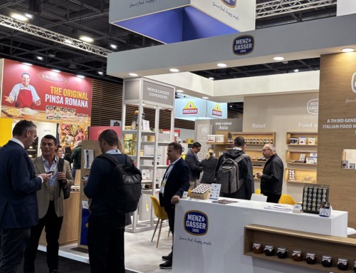
And that is exactly what Menz&Gasser has done recently when restyling our logo in partnership with the Verter agency.
There are two key new features:
- The graphic design has received a fresh, contemporary makeover with a more modern new typeface (suitably tailored) and a flat version in colour.
- The logotype now includes the date “1935”, a new graphical element that enhances the overall visual proportions and highlights when the company was founded, thus reinforcing the brand’s position as a reliable, highly experienced partner.
The decision to revamp the logo was taken after a period of considerable renewal and innovation that has seen the company open new sales channels, expand its product and service portfolio, and boost its presence in overseas markets while moving ahead with its sustainability strategy.
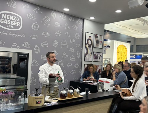
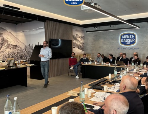
The ability to present itself to national and international markets with a renewed identity and a strong, clear image will help bolster Menz&Gasser’s brand identity and positioning as an excellent partner for the Ho.Re.Ca, Bakery and Pastry, Retail and food sectors.